

About ServiceNow
ServiceNow is a cloud-based company that provides software as a service (SaaS) for technical management support. The company specializes in IT services management (ITSM), IT operations management (ITOM), and IT business management (ITBM), allowing users to manage projects, teams, and customer interactions via a variety of apps and plugins.

0 - Background
A massive amount of automation and digital transformation occurs in the business world. The International Data Corporation (IDC) estimates that 500M new apps will be created in the near future, but there is a shortfall of 500K developers alone in the US. This is the “app gap”. Low-code and no-code platforms are evolving the tooling to allow businesses to build new apps faster and allow non-coders within a company to be involved.
This led to the creation of App Engine Studio (AES). A fast, intuitive, low-code visual development environment that empowers users of every skill set to collaborate and build applications to power the digital enterprise.
1 - The brief
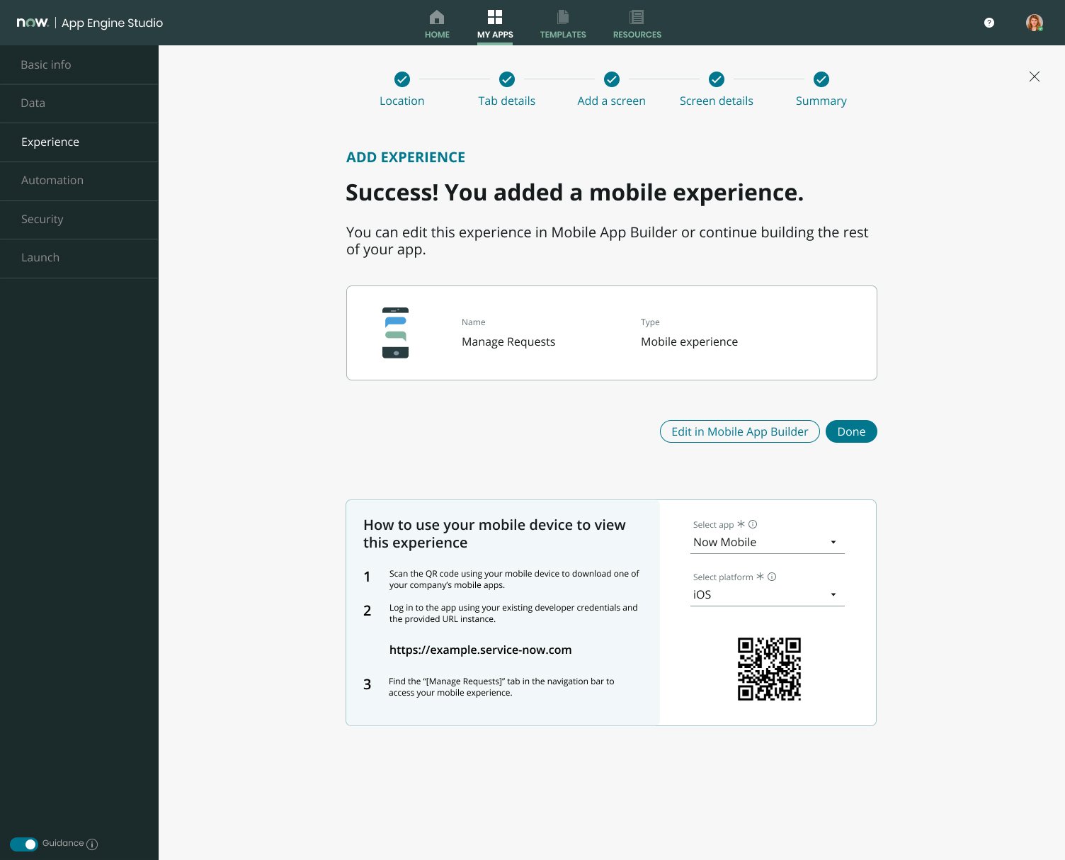
ServiceNow’s mobile framework enables the creation of rich native mobile experiences offering expansive functionalities. In doing so, however, these mobile ‘apps’ can be quite complex to set up, and only highly skilled developers can do so. The new mobile experience initiative in App Engine Studio is intended to reduce the setup complexity to enable lower-skilled (e.g., citizen developers) to complete these tasks.
The mission was to reduce the friction a citizen developer encounters when building and deploying their applications.
The goal was to enable developers to build simple mobile apps without immersing themselves in another builder experience.
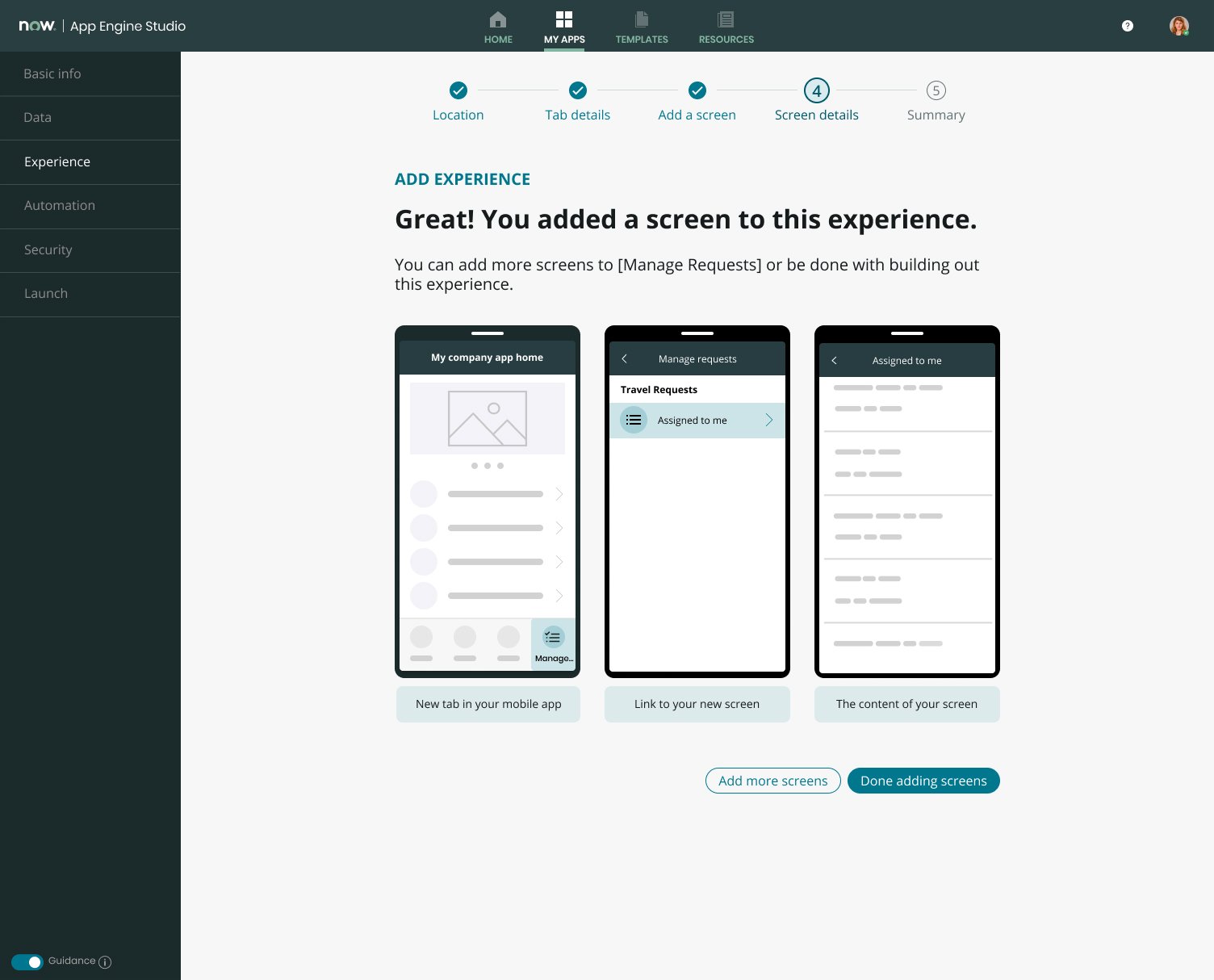
The strategy was to use simple wizard experiences that guide developers through options that ultimately yield their desired outcomes.
2 - Role
My role in the project was Lead Designer for creating a mobile experience in App Engine Studio. I was directly involved in every phase of the product creation: discovery, definition, design, and delivery of the project. I work closely with a content designer, a UX researcher, a product manager, and a lead developer.
3 - Auditing our own mobile creation process
As part of this effort, a farm audit was conducted to gather data on all custom mobile applications our customers had created. The goal of this audit was to understand the most common set of features that are being utilized today and be able to ensure the new mobile wizard experience provides developers with the right options to enable these features without always having to use Mobile Studio (the current software used to create a mobile experience).

Screen types used in mobile apps
The data below indicates that 80%+ of mobile apps use List & Forms. The data also showed that the activity stream is a popular add-on, and even the browser/URL screen is used in 1 out of every five mobile apps. With this, the mobile wizard should focus on providing an intuitive setup for List + Form and Browser screens only. Related Lists can be tackled in a future release as this would greatly increase the scope.

Data Items - Overview
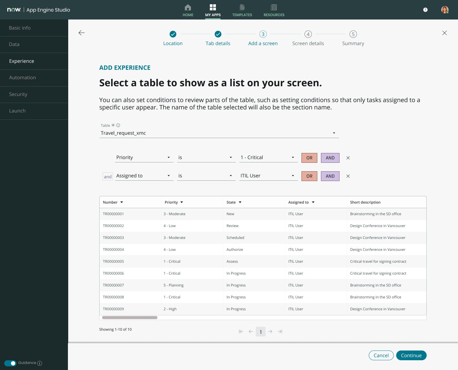
The data below indicates that 62% of all data items have associated query conditions. With this, developers should also be able to specify query conditions when setting up a data source (table) using the wizard. The data also shows that 1 in 4 apps have multiple data items using the same table and only vary by query conditions. This indicates that the wizard should allow developers to create multiple lists per table.

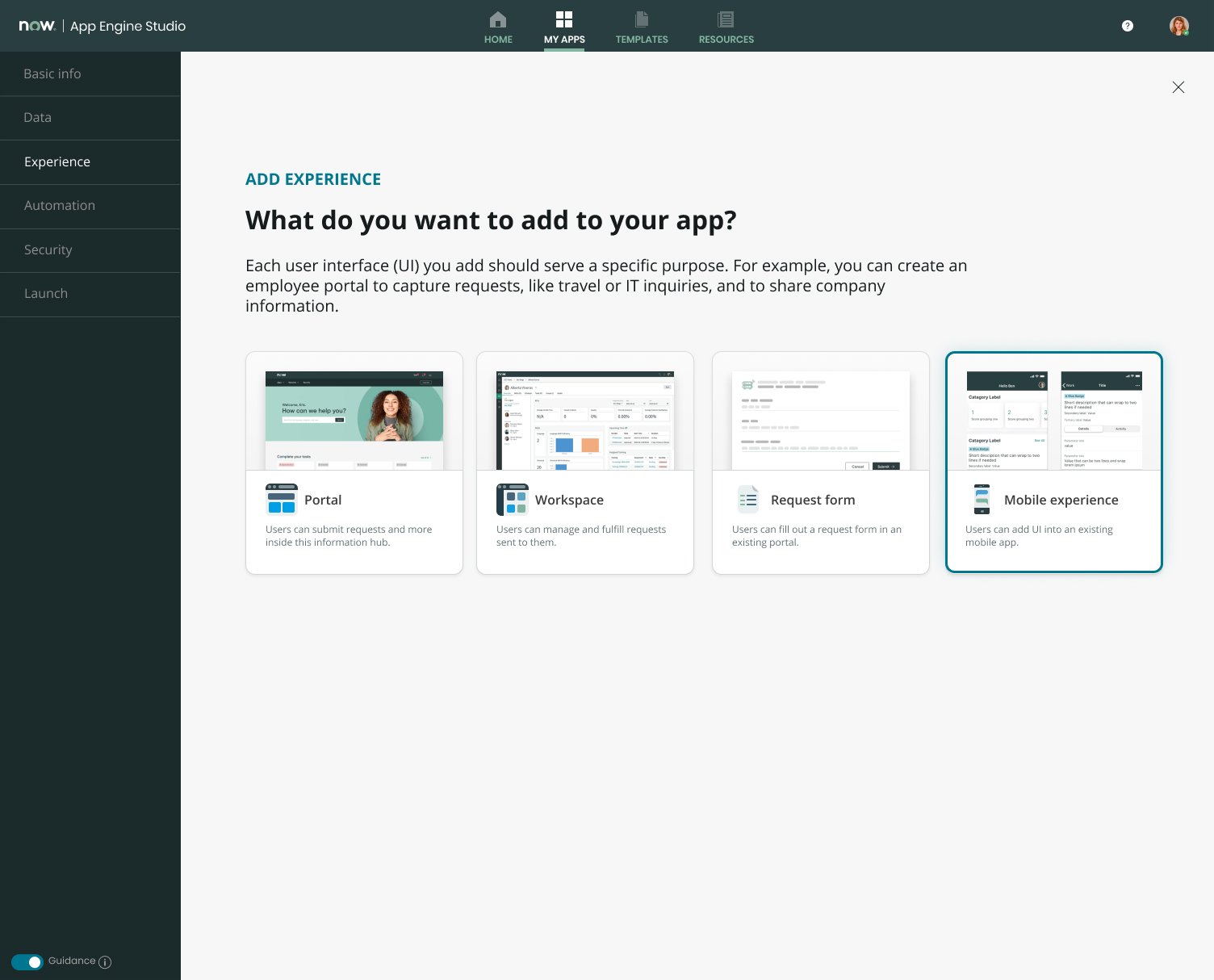
4 - User journey (Citizen developer)
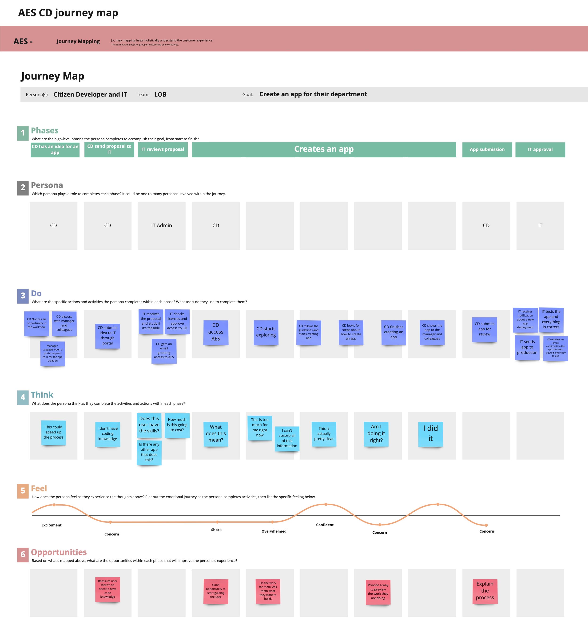
6 - Must-haves
After gathering all the data, I could start building user scenarios. This was necessary in order to create a roadmap for the new mobile experience.
Citizen developers should be able to:
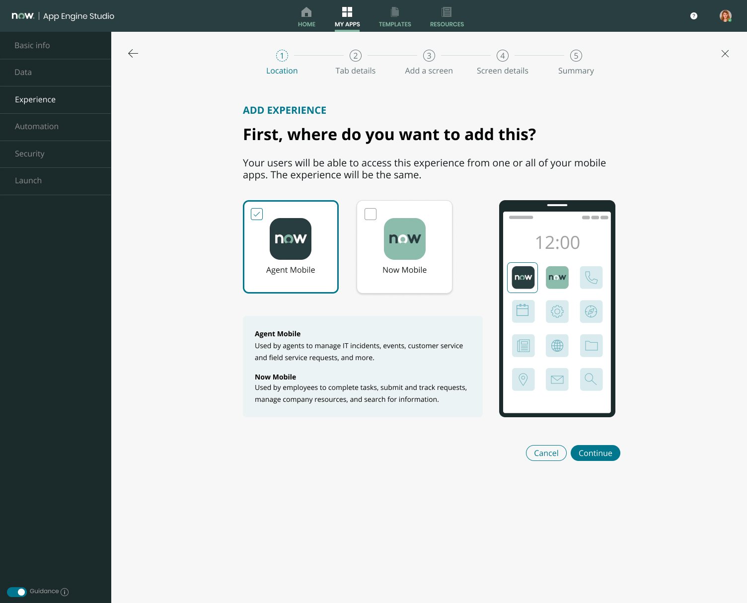
Choose which native mobile clients they want my mobile ‘app’ to live in so they can choose the right experience for their use case and target persona.
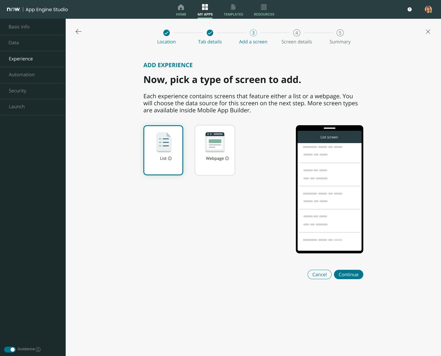
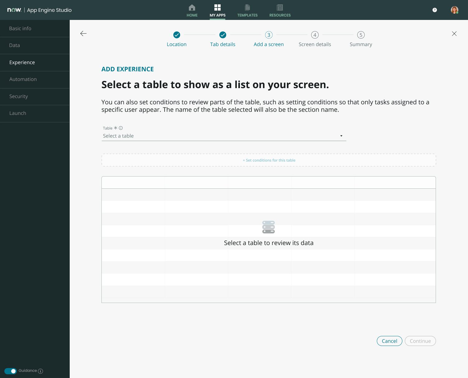
Create simple List & Form experiences on their mobile ‘app’ for any data sources (tables) of their choosing so they can provide their end-users the ability to view and edit data on their mobile devices.
Create multiple lists for a specific table using different query conditions so they can provide their end-users with different views of their data (e.g., Open Incidents vs. Closed Incidents).
Create simple links on their mobile ‘app’ to provide end-users quick access to specific web resources.
Citizen developers shouldn’t have to:
When setting up a List & Form experience, they should not have to manually set up actions to enable basic CRUD functions on the data I selected. This should work as it does on the platform.
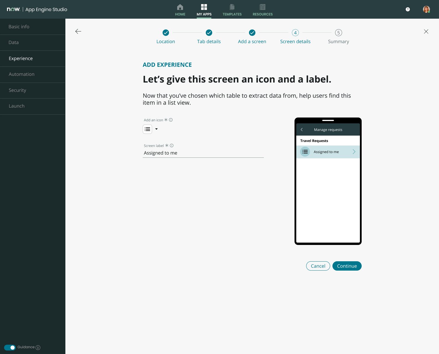
When setting up a List & Form experience, they should not have to manually layout their cards or forms. The wizard should apply smart defaults similar to the platform and provide them with a default layout for each.
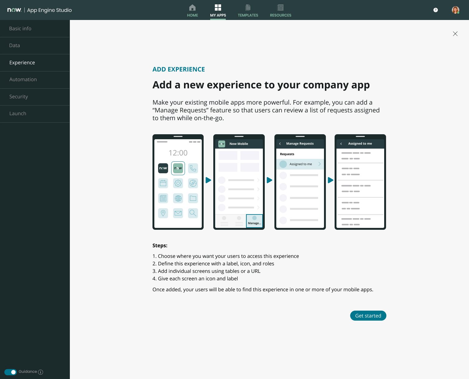
5 - Flow

7 - Design
Election of a wizard model. I decided to explore the wizard model for this project because it has a few benefits for reaching a goal:
Wizards provide artificial progress towards a goal that will help ensure users are motivated to complete that task.
Wizards break complex tasks into smaller steps to decrease the cognitive load.
8 - Testing, results, and learnings
A UX researcher and I conducted the testing sessions. During the testing session, I provided the material to test and take notes. The sessions were 45-minute individual sessions conducted via Zoom using interactive prototypes
Participants were asked to perform tasks and provide thoughts/opinions on what they saw and experienced. The tasks were:
Create a new mobile experience
Add a list screen that includes critical tasks that are assigned to me. They should all be related to travel requests.
Now add a mobile web screen called News, and to that experience, set the URL to servicenow.com
After performing tasks, participants were asked to rate agreement with three statements using a 5-point scale.
What I saw today...
It seems easy to use/figure out on my own.
It does a better job than my current tools to configure mobile apps.
It is ready for me and others in my role to use.
Ratings

What did I learn from this project?
Users want previews of data. They want to see their real data, not an abstract view of it.
Users expect brief descriptions of items upfront. They don't want to click an icon or hover over an item to find out what it is. If the real estate is there, they want it used—for example, more explanation around the screen types.
Users were familiar with "Mobile experience" and "screens" as terminology. With the available context, this terminology worked for all users and was easy to grasp.
Most participants focused on the titles/headers, not the sub-text.
Wizard was helpful and provided the context for creating a mobile experience. Learning by doing.
Highlighted quotes
"Loved wizard interface"
"Order of screens makes sense. It was like a file tree, logical”.
"Abso-freakin-lutely," when responding to whether this tool is better than current tools available for configuring mobile

